This is the end product reflecting overall bike usage patterns and identifying potential seasonal trends.
See interactive usage
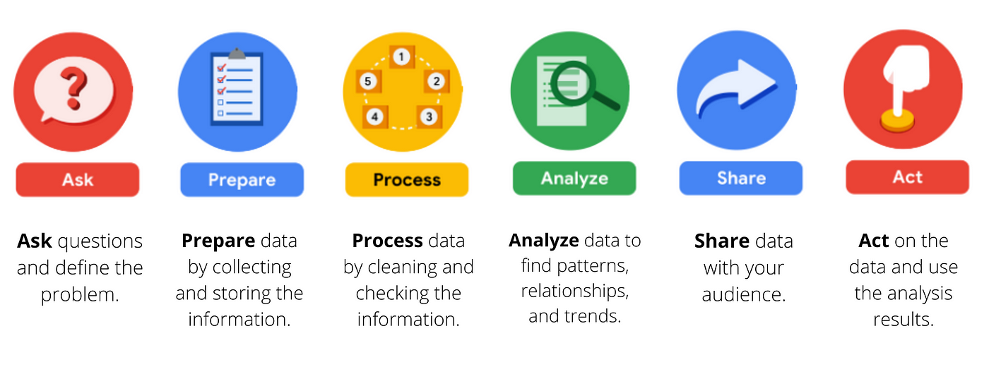
In this project, I aim to highlight my thought process and proficiency in tools such as Python, pandas, and Tableau, focusing on how I approach each phase of the data analysis development cycle rather than solely presenting the case study itself.
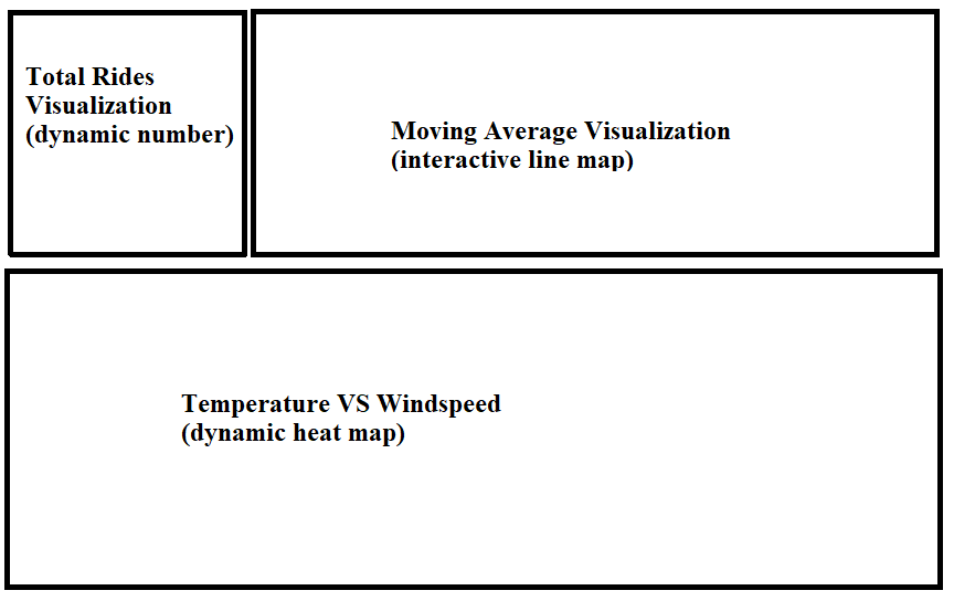
My goal is to create a dynamic dashboard to help people analyze overall bike usage patterns and identify potential seasonal trends. This dashboard will show the impact of weather conditions on bike sharing usage and can be used to make data-driven decisions. Below is a preliminary outline of my dashboard's design.
I am going to be using the pandas library to process and clean my data. Here I am using pandas to extract meaningful insights about the data.
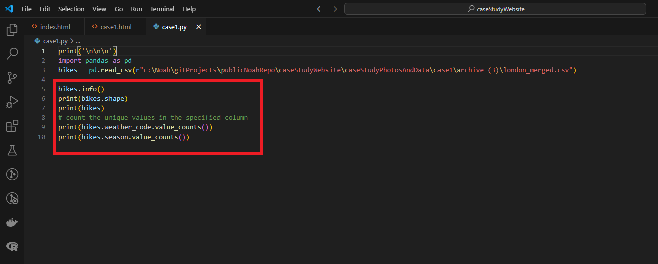
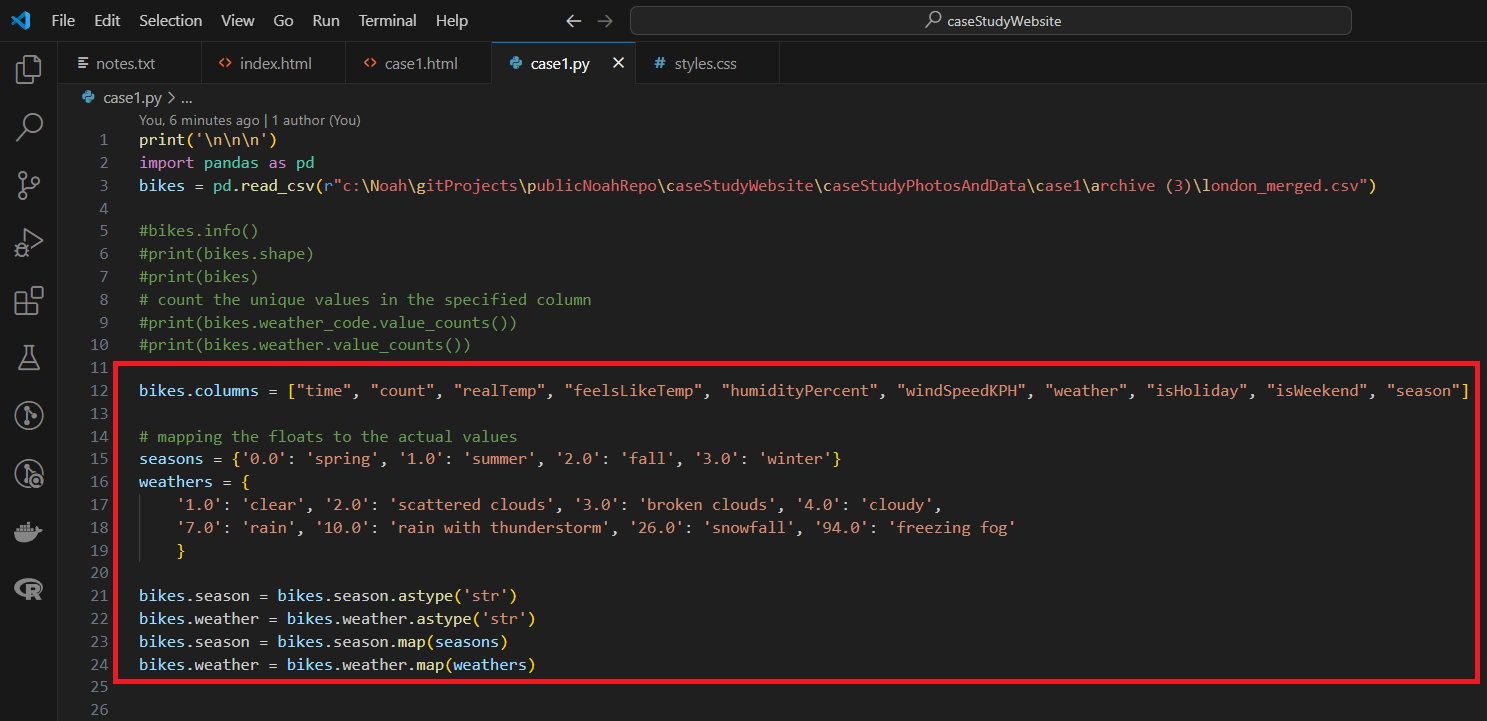
After viewing the data and metadata I decide to rename the columns to something more significant and simple. I then mapped the floats to the actual values in the columns: "weather" and "season" .
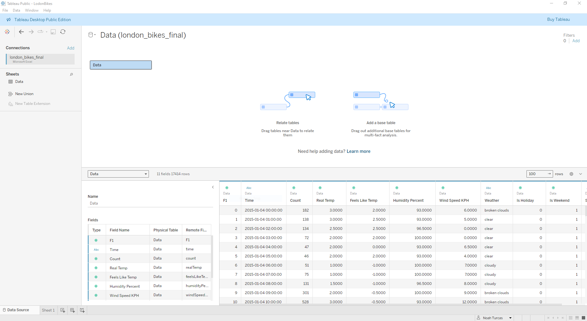
For my next step, I transfered the cleaned data to Tableau to create visualizations.
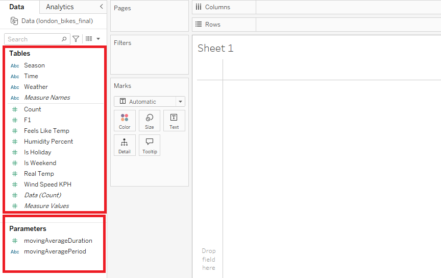
Here I created parameters and calculated fields. I will be using these to create 3 sheets and then assemble them into an interactive dashboard.
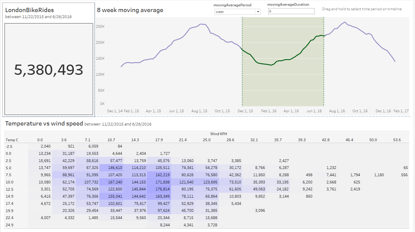
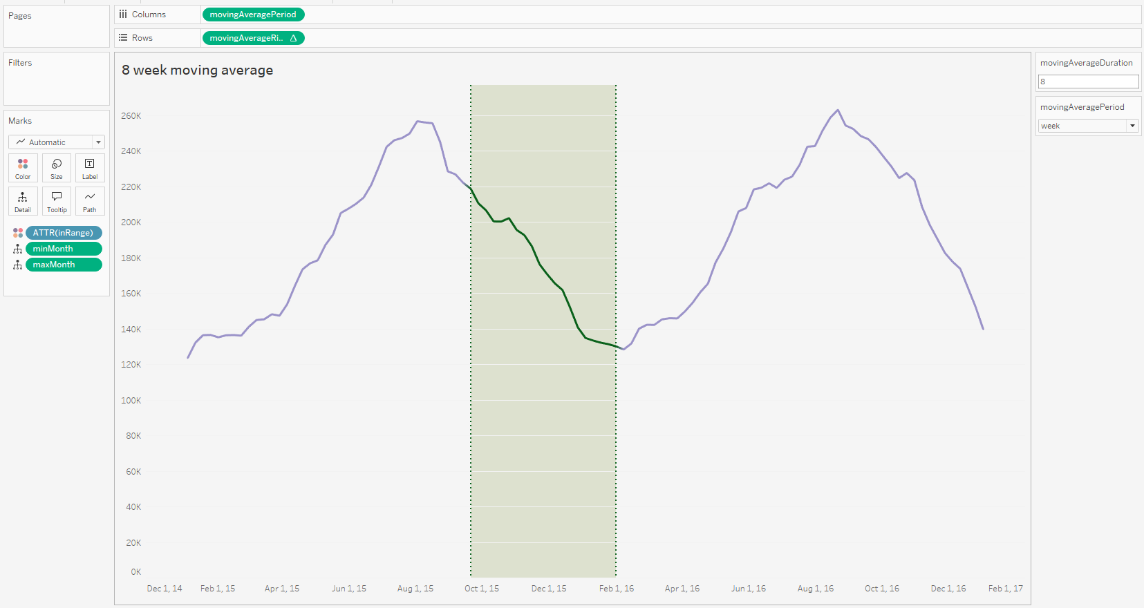
My first visualization is an interactive line chart. This line chart visualizes the 8-week moving average highlighting trends over time. The green-shaded area focuses on a specific period of declining usage, potentially indicating seasonal patterns or other external factors affecting bike share activity.
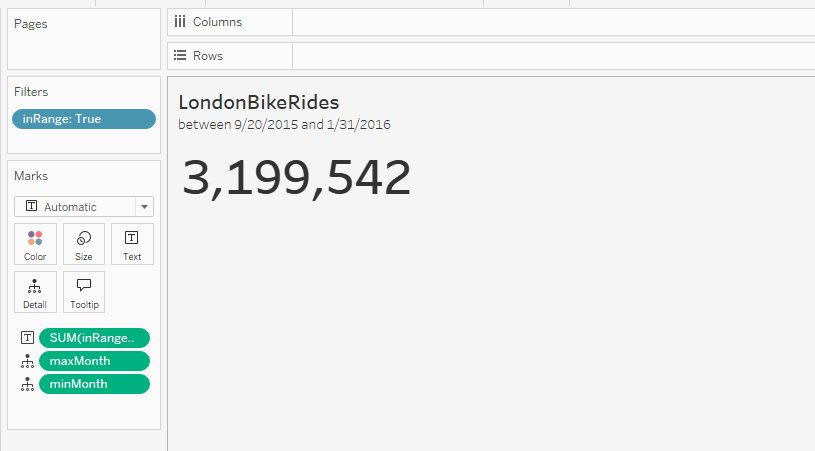
My second visualization is the total number of rides that changes dynamically based on the time frame selected on the line chart.
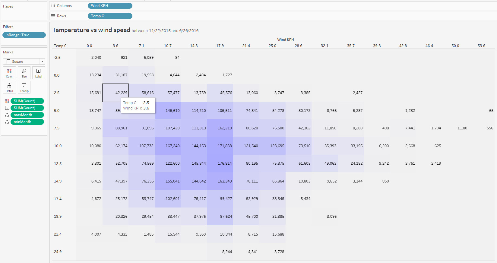
This dynamic heatmap is designed to show data based on the relationship between temperature (°C) and wind speed (KPH) within a specific time frame. The time frame is controlled by a filter linked to the line chart, allowing users to adjust the period of analysis dynamically.